
Black Skirting Board Guide - Free Delivery
Posted by Sultan Khan on 27th Feb 2026
Black skirting boards used to feel like a risk. They've become a lot more common in recent years, and the look works across far more spaces than you expect. Whether you're painting your existing skirting boards or fitting new ones in a black finish, there's more to consider than just the colour itself.
Black skirting with lighter walls
The most common starting point is pairing black skirting boards with white or light-coloured walls. The contrast draws the eye downward and gives the room a defined perimeter, almost like a picture frame for the space.
This works particularly well with taller skirting that has some profile detail. In white, those details can disappear into the wall. In black, every moulding line and shadow becomes visible.
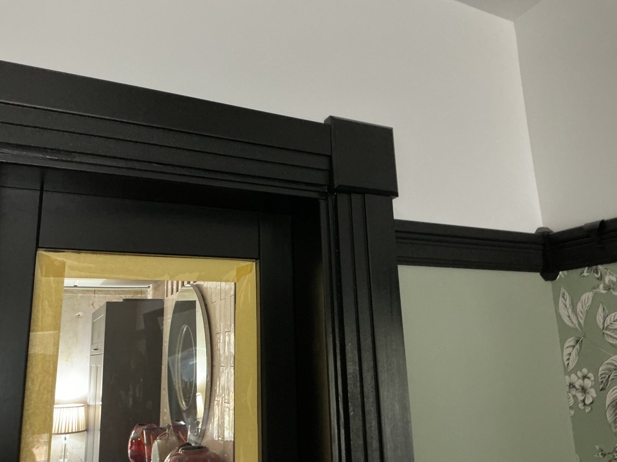
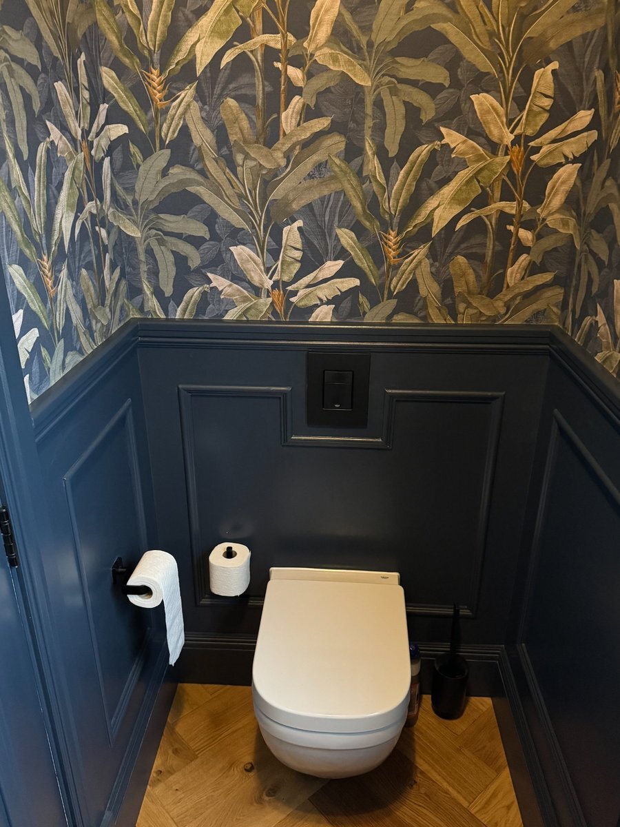
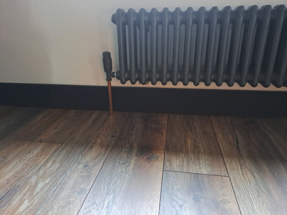
One thing that often gets overlooked is continuity. Black skirting on its own can look isolated if the door frames and architrave remain white. Carrying the black through to all the woodwork in a room creates a deliberate look rather than one thrown together.
The image below shows what this kind of continuity looks like up close. The Stepped 1 skirting and matching architrave are painted the same black, with a picture rail running across the wall and rosette blocks tying the corners together. Every piece of woodwork reads as one scheme.
If full black-on-white contrast feels too stark, softening the walls with a warm grey or off-white can ease the transition. Black skirting with grey walls still provides definition but the overall effect is less dramatic.
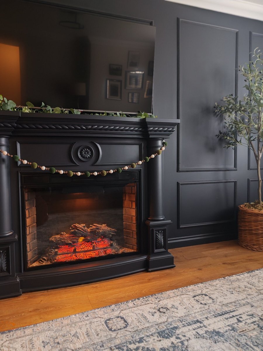
Dark walls and dark woodwork
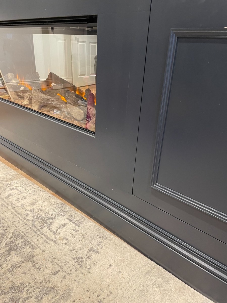
The opposite approach is to go dark on everything (also calle colour drenching): walls, skirting, and door frames in the same black or near-black shade. Rather than framing the room, the skirting disappears into the walls. The woodwork stops being a feature and becomes part of the background, which shifts all the visual attention onto your furniture, artwork, and lighting.
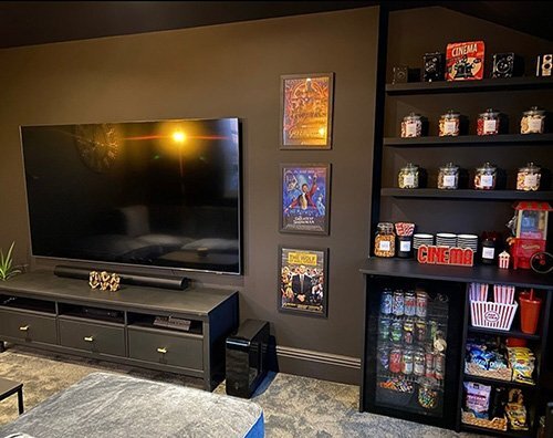
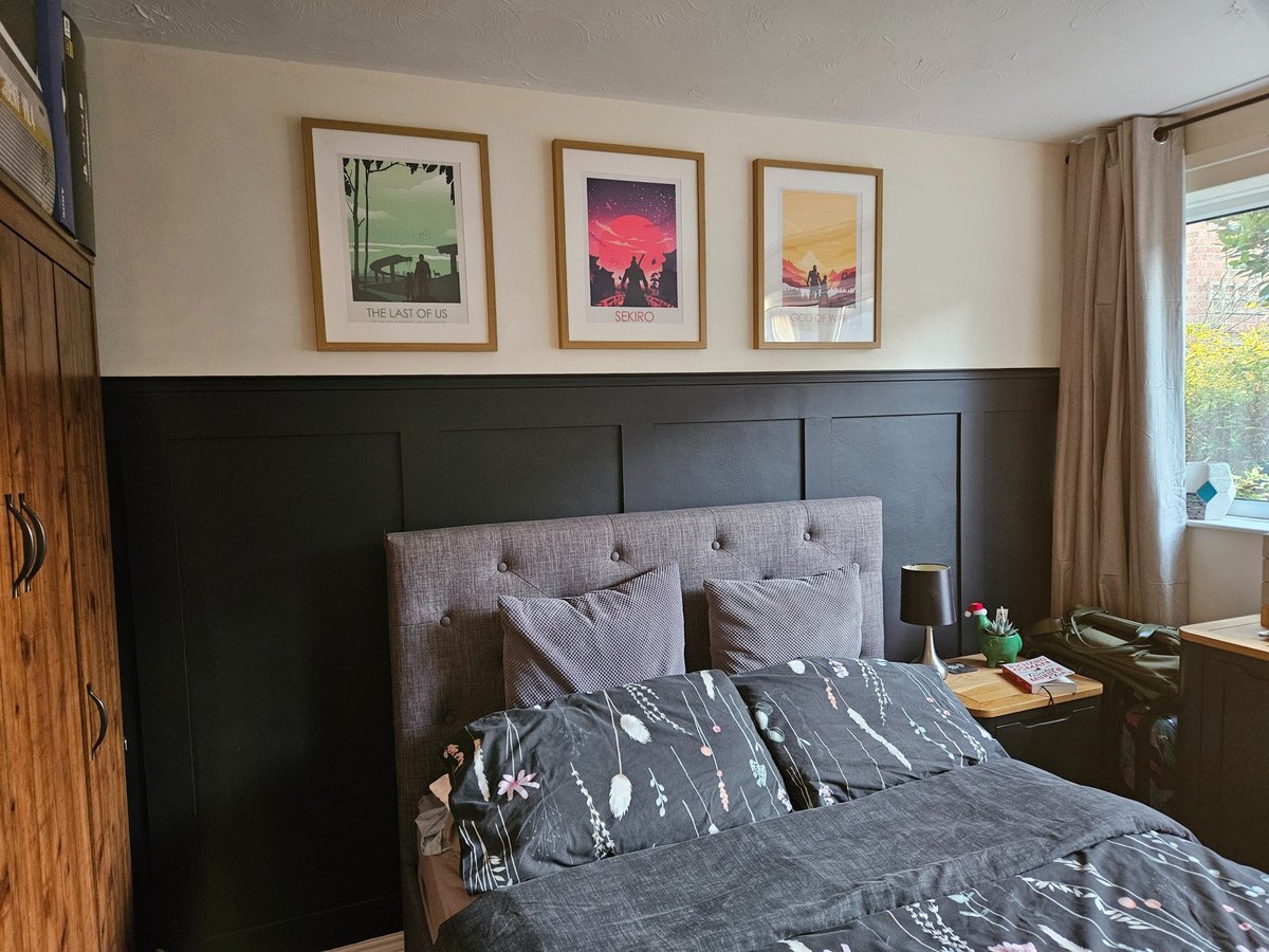
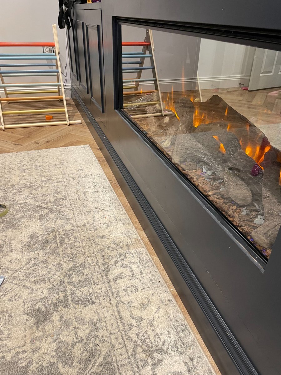
This tends to work best in rooms where you actually want that cocooning atmosphere. Cinema rooms and entertainment spaces suit it well, as do bedrooms where a darker palette creates a calmer environment for sleep. Feature walls with panelling and a fireplace surround are another natural fit.
The key consideration with an all-dark scheme is lighting. Rooms with decent natural light during the day can absorb darker finishes without feeling oppressive. For rooms with limited windows, layered artificial lighting becomes more important: a mix of overhead, task, and ambient light sources prevents the space from feeling flat.
For a fully committed black interior, opting for black doors ties the scheme together completely. The furnishings then become the sole source of colour and contrast in the room.
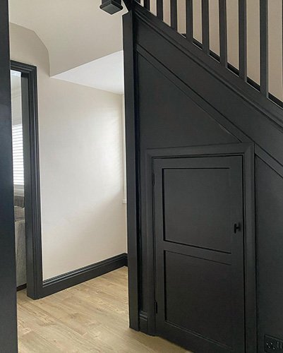
Black skirting in smaller spaces
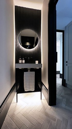
There's a common assumption that dark colours shrink a room. In practice, black woodwork in a bathroom, cloakroom, or hallway often does the opposite: it gives the space a sense of intention and considered design that a white-on-white scheme sometimes lacks.
Cloakrooms and downstairs WCs are particularly good candidates. These are spaces where you can afford to be bolder precisely because people spend less time in them. A dark skirting and panelling scheme paired with a patterned wallpaper above can turn a forgettable utility space into something worth noticing.
Hallways benefit from black skirting for a more practical reason too. They take more foot traffic than almost any other area in a home, so scuffs and marks are inevitable. Black woodwork handles that wear far better than white.
How profile choice changes in black
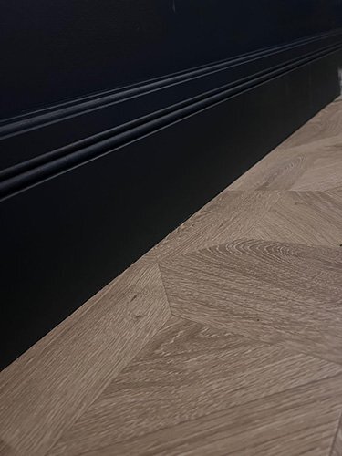
The same skirting board profile can look completely different depending on whether it's painted white or black, because darker finishes change how shadows and highlights interact with the moulding.
In white paint, light bounces off moulding detail and shadow lines tend to soften. In black, those shadows deepen and the profile becomes much more pronounced. Curves read as more defined. Grooves appear deeper. Stepped details create stronger horizontal lines across the wall.
This means a profile that looks subtle in white might feel quite ornate in black. And a profile with heavy detail that works well in white can look busy when painted dark. The general rule: simpler profiles tend to be safer in black, while more detailed profiles need careful consideration.
For contemporary spaces, a square edge or pencil round profile gives you that clean horizontal line without any fuss. For period-style rooms that already have ornate cornicing or panelling, a more detailed moulding profile can work well in black because the detail echoes what's happening elsewhere in the room.
If you're unsure, ordering a sample and holding it against your wall at the intended height is the most reliable test. A profile that looks right on screen doesn't always translate in person, especially in darker finishes where the subtleties are amplified.
Picking the right black paint
Not all blacks are the same. Most black paints carry an undertone that shifts their appearance depending on the light conditions in your room and the colours around them.
Blue undertones produce a cooler, crisper black that sits well alongside grey walls and cool-toned flooring. Brown undertones create a warmer black with a slightly softer feel, which tends to pair better with natural wood floors and warmer wall colours. If you pick a shade that's too light or too heavily tinted, you'll end up with something that reads as dark grey or charcoal rather than black. That isn't necessarily a problem, but it's worth being intentional about it. We've covered grey skirting boards separately if that's more your direction.
Popular blacks worth sampling
Farrow & Ball's Railings is one of the most widely used blacks for woodwork in the UK. It has a subtle blue-black quality that reads as rich and deep without being flat. Their Off-Black is slightly softer if you want something a touch less absolute. On the more affordable side, Dulux Rich Black provides a straightforward, neutral black that works in most contexts. It's a reliable choice if you're not chasing a specific undertone.
Finish matters as much as colour
The sheen level you choose has a significant impact on how your black skirting looks and performs. There are three main options to weigh up:
Gloss
The most hardwearing option. High sheen highlights profile detail and bounces light around the room. Shows dust, fingerprints, and surface imperfections more readily. Best suited to well-prepared surfaces and traditional interiors.
Eggshell
Very low sheen, almost flat. Gives a modern, understated look and hides minor surface imperfections well. Less durable than gloss or satin, so better suited to lower-traffic areas.
Satin
A middle ground between gloss and eggshell. Wipeable, durable enough for hallways and living spaces, with a soft sheen that doesn't draw attention. The most popular choice for black woodwork.
For more detail on paint types and application, our paint guide covers the full range of options, and our guide to glossing skirting boards walks through the technique if you're going for a high-sheen finish.
If you'd rather not paint them yourself, we now offer a black finish on our MDF skirting boards and architrave, applied in-house on our spray line. They arrive ready to fit.
The practical side of black woodwork
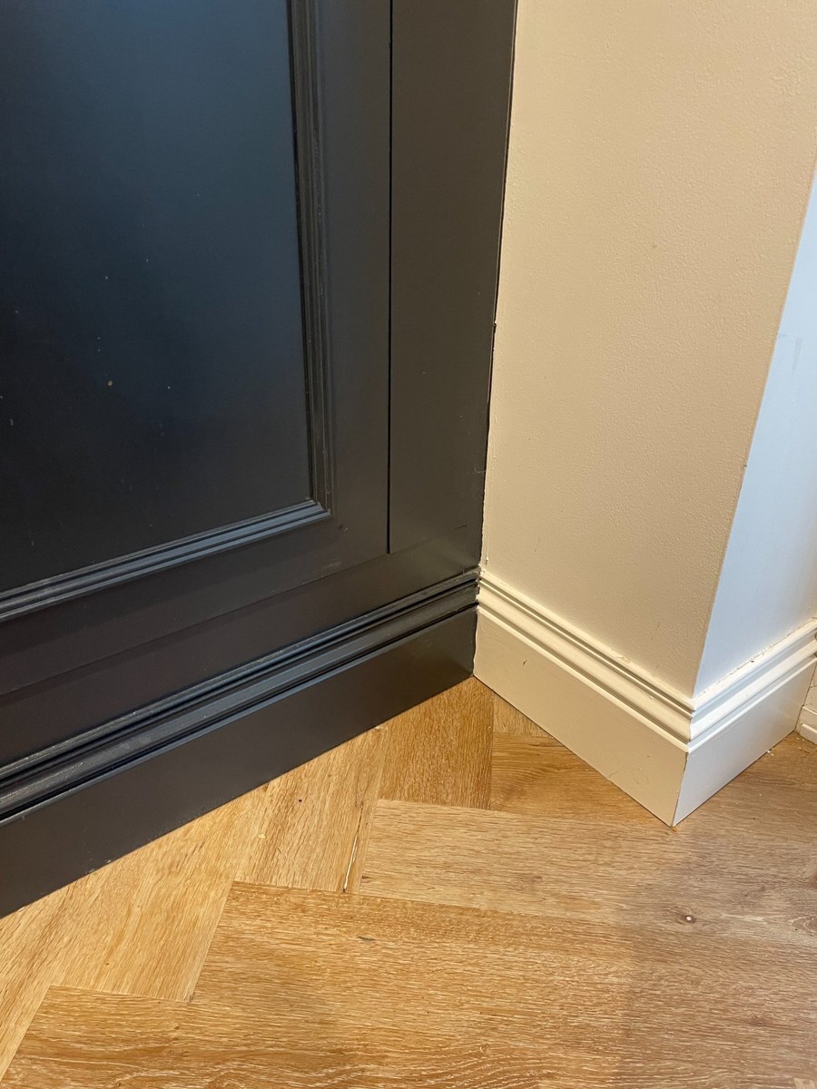
The most noticeable practical difference with black skirting is that it hides scuffs, shoe marks, and general wear far better than white. Skirting boards sit at floor level and take a surprising amount of abuse from vacuum cleaners, furniture legs, children's toys, and foot traffic. In white, every scuff eventually shows. In black, most of it disappears.
The trade-off is dust. Black surfaces show dust more visibly than white ones, particularly in rooms with direct sunlight. A thin layer of dust that's invisible on white skirting becomes obvious on black. The net result for most people is that black skirting needs cleaning less frequently for scuffs but might need a quick wipe more regularly for dust. In practice, running a damp cloth along the skirting during your normal floor clean keeps on top of it without much extra effort.
Black vs white skirting at a glance
| Black | White | |
|---|---|---|
| Scuffs and marks | Mostly hidden | Visible over time |
| Dust visibility | Shows more readily | Less noticeable |
| Touch-up painting | Easier to blend seamlessly | Touch-ups can yellow differently |
| Profile detail | More pronounced | Softer, less defined |
Touch-up painting is easier with black too. White skirting can be difficult to touch up because white paint yellows at different rates, so a fresh patch against an older finish can look mismatched. Black paint doesn't have this problem. A quick touch-up blends in almost invisibly.
Testing the look before you commit
The simplest way to gauge whether black skirting works in your space is to paint a short section of your existing board and live with it for a few days. You'll quickly get a sense of how it sits with your flooring, wall colour, and the light at different times of day.
Our MDF skirting boards and architrave are available in a black finish applied on our in-house spray line, so they arrive ready to fit. If you'd rather paint them yourself, the primed or undercoated finishes provide a smooth base for your chosen black.
If you do go ahead with it, tag us on Instagram at @skirtingworld. We feature customer projects regularly.